Case Study:
Montlie App
Montlie is an app that provides women with free feminine hygiene products. My goal was to create a user-centered design that makes it easier for users to acquire the care that they need. This project consists of the entire workflow from initial sketch, UX research, wireframing, prototyping to fully functioning App.
ROLE
UX Research
Interface Design
Prototyping
TEAM
Self-Directed
CLIENTS
Montlie
YEAR
Winter 2023
(4 weeks)

.png)
Understanding
the User
User research
Personas
Problem statements
User journey maps
User Research
I conducted interviews and created empathy maps to understand the users needs. A primary user group identified through research were women in vulnerable or low-income communities.
This user group confirmed initial assumptions about Montlie's customers, but research also revealed that cost was not the only factor limiting users from acquiring feminine hygiene products. Other user problems included safety issues, inconvenience and emotional challenges that make it difficult to get supplies at the store in-person.
Research also revealed that some users expressed the willingness to pay for feminine hygiene products so that others can receive them for free.
Personas
User Pain points:
Cost, insecurity, inconvenience.
By using the data I gathered from the interviews and empathy maps, I created a series of personas to help me get a better understanding of the users that i'll be designing for.


Problem Statements
CASEY
18
Casey is a young college student, who wants a cheap, reliable. and discrete way of accessing feminine care products because she wants to feel secure and taken care of without breaking her budget.
ROBERT
37
Robert is a single dad of 2 who needs to be able to easily find free feminine care products for his daughters because he loves his daughters and wants to provide them with the care they need.
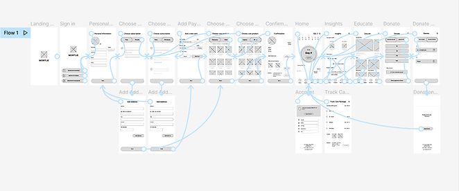
User Journey Maps
Finally, I ended the User Research section with User Journey maps.
Given Task:
The users are looking for how to get free feminine hygiene products. Download the Montlie app, register an account and then access the free care package.
Mapping the persona’s user journey revealed how helpful it would be for users to have access to a dedicated Montlie app.
Starting the
Design
Competitive Audit
Paper wireframes
Digital wireframes
Low-fidelity prototype
Usability studies
Competitive Audit
To start the ideation process, I conducted a competitive audit so that I could understand what user needs are already being met in the marketplace and how my design can improve on current solutions.
The major takeaway from the competitive audit was that most of Montlie’s competitors fall under the indirect category for, they are branded as period trackers. This is really an advantage because Montlie offers the same digital services ( Period tracking, Ovulations tracking and PMS) as its competitors as well as free sanitary products such as Tampons and Period Pads.
Paper Wireframes
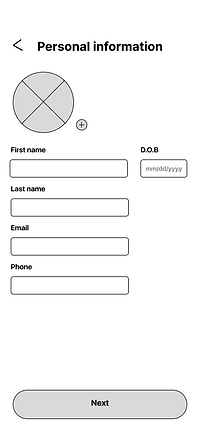
After conducting a competitive audit report, I started the design process by running a crazy 8 exercise to get the ideas rolling. I then proceeded to sketch paper wireframes. Taking the time to draft iterations of each screen of the app on paper ensured that the elements that made it to digital wireframes would be well-suited to address user pain points.
I prioritized a quick and easy registration process and, for the home page I used the gestalt principles to group elements so that users can easily navigate to the appropriate app features that they want to utilize.
Stars were used to mark the elements of each sketch that would be used in the initial digital wireframes.


Usability Studies
I conducted two rounds of usability studies. Findings from the first study helped guide the designs from wireframes to mockups. The second study used a high-fidelity prototype and revealed what aspects of the mockups needed refining.
New Problem:
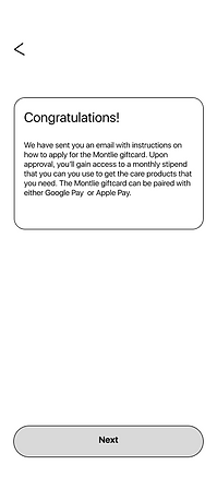
Key findings from the usability study revealed a major problem. Some users could not complete the tasks given because they did not have physical mailing addresses. Having an address is needed for users to receive their free care products.
Solution:
I had to go back to the drawing board to come up with an alternative for user to still get access to the free feminine hygiene products that they need. To do this, I had to create a new persona with the new found user problem.
I then made iterations to the digital wireframes by creating a new screen that asks users if they had a mailing address. If they select 'Yes", Users would continue with the original user flow and if they select "No" then it would continue with a new user flow.
The new user flow omits the need to select care products because of the absence of an address instead, eligible users will get access to a Giftcard that provides them with a monthly stipend so that they can purchase the products that they need.
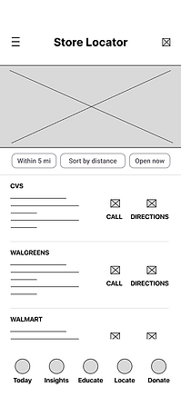
I also added a new feature that enables users to find nearby stores so that they could easily acquire care products using the Montlie Giftcard.


Refining the
Design
Mockups
High-fidelity prototype
Accessibility
Mockups
After resolving the problems that was highlighted during the usability studies, I started to create mockups. I included text, colors, icons, buttons and, high resolution images to bring the app to life.


.png)
.png)
High-Fidelity Prototype
After finalizing the mockups, I created a high-fidelity prototype. The final high-fidelity prototype presented cleaner user flows for registering a user account and tracking care packages.
It also met user needs for a safe and discrete way to obtain free feminine hygiene products. It also provides users with educational materials for women to better understand their menstrual health.


Going forward
Take aways
Next steps
Take Aways
Impact:
The app makes users feel like the Montlie app really thinks about how to meet their needs.
One quote from feedback:
“The app made it so easy and fun to get free feminine hygiene products! I would definitely use this app as a go-to for my menstrual health.”
What I learned:
While designing the Montlie app, I learned that the first ideas for the app are only the beginning of the process. Usability studies and user feedback influenced each iteration of the app’s designs.
Next Steps
Conduct another round of usability studies to validate whether the pain points users experienced have been effectively addressed.
Conduct more user research to determine any new areas of need.