Case Study:
M-Theatre App
The M-Theatre is a regional Movie Theatre located in the suburbs of a metropolitan area. M Theatre aims to deliver the best movie experience for avid movie-goers.
The problem:
Busy workers that enjoys going to the movies during their spare time but have trouble deciding what movie to go watch at the theatre.
The goal:
Design an app for M-Theatre that allows users to easily pick movies and purchase movie tickets.
ROLE
UX Research
Interface Design
Prototyping
TEAM
Self-Directed
CLIENTS
M- Theatre
YEAR
Fall 2021
(8 weeks)


Understanding the User
Design Process
User research
Personas
Problem statements
User journey maps
Design Process

I decided to use the Design thinking Process as illustrated above to help me proffer an advanced solution to this issue.
User Research
I conducted interviews and created empathy maps to understand the users needs. A primary user group identified through research was working adults who enjoys watching movies at the theatre but does not want to spend most of their limited spare time deciding what movie to go watch.
This user group confirmed initial assumptions about M Theatre’s customers which revealed that time was the major factor limiting users from buying movie tickets.
Research also revealed that User’s when trying to buy a movie ticket online become confused or unable to make a decision due to many factors, some of which include:
-
Overwhelming amount of movie titles
-
Inability to have an idea of what the movie will look like.
-
Indecision
Personas
User Pain points:
Time, Overwhelmed, Uncertainty, Indecision.
By using the data I gathered from the interviews and empathy maps, I created a series of personas to help me get a better understanding of the users that i'll be designing for.


Problem Statements
ALLISON
21
Allison is college student, who wants a movie app that has user ratings because she wants to be able to tell if she would enjoy the movie she chooses.
BEN FOSTER
34
Ben is a busy nurse who needs an effective way to choose and buy movie tickets because he does not want to spend most of his limited free time searching for a movie to watch.
User Journey Maps
Finally, I ended the User Research section with User Journey maps.
Given Task:
The users are looking for an easy way to choose and purchase movie tickets. Download the M-Theatre app, search for a movie and purchase a ticket.
Mapping the persona’s user journey revealed how helpful it would be for users to have access to a dedicated M-Theatre app.
Starting the Design
Competitive Audit
User Flow
How Might We (HMW)
Paper wireframes
Digital wireframes
Low-fidelity prototype
Usability studies
User Flow
Using the data collected from the competitive audit and user research, I created a user flow to provide a clear and concise overview of the contents of my project.
![M-Theatre Design Process [Recovered]-02.png](https://static.wixstatic.com/media/0d95f5_e1f511cd74e04849bdf51a5478dee5b9~mv2.png/v1/fill/w_669,h_280,al_c,q_85,usm_0.66_1.00_0.01,enc_avif,quality_auto/M-Theatre%20Design%20Process%20%5BRecovered%5D-02.png)
How Might We (HMW)
Based on my Affinity Diagram, I listed down the possible HMW questions that aligns with the users’ problems. I found common themes and insights which played an important role in developing my HMW questions to better identify ways in solving the users’ problems.
![M-Theatre Design Process [Recovered]-03.png](https://static.wixstatic.com/media/0d95f5_51a7a31b03604aa892d16274525a4f42~mv2.png/v1/fill/w_694,h_462,al_c,q_85,usm_0.66_1.00_0.01,enc_avif,quality_auto/M-Theatre%20Design%20Process%20%5BRecovered%5D-03.png)
Solutions
As identified in the HMW questions listed above, there are 2 main focus on how to make this movie app scalable.
-
How to help users find their movie of interest.
-
How to help users get a preview of what movies they may be interested in before purchasing movie ticket.
My solution to the issue of interest would be to provide users with recommended movies based on user preference. this can be achieved by creating a preference screen asking users to choose from a variety of categories.
I will also include trailer videos, synopsis and user ratings to help users know if movie of choice picks their interest.
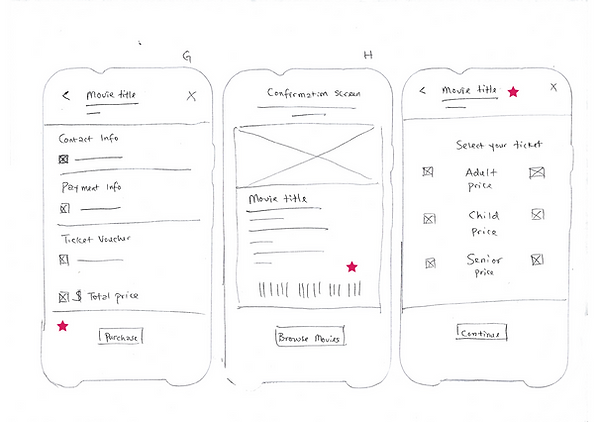
Paper Wireframes
To ensure the elements of the app addressed user pain points, I took the time to go through an iterative design process. This included running a Crazy 8 exercise to jumpstart my creative process, followed by sketching paper wireframes of each screen of the app.
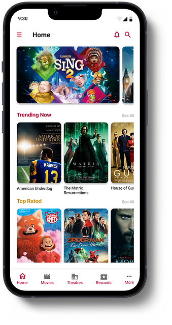
I then designed a system to provide users with tailored movie recommendations based on their preferences. To achieve this, I created a "Choose Preference" screen which allows users to select the type of movies they would like to watch. The home screen UI is then populated with movie suggestions tailored to the user's preferences, making it easier for them to choose which movies to go and watch at the theatre.
A paper prototype was created to evaluate the information architecture of the application, consisting of the Splash screen, Sign up screen, Preference screen, Home screen, Movie detail screen, Choose seat Screen, Card detail screen, Purchase succeeded screen, and Ticket detail screen.
Stars were used to mark the elements of each sketch that would be used in the initial digital wireframes.


Usability Studies
I conducted a round of usability study. Findings from the study helped guide the designs from wireframes to mockups.
Findings:
-
It wasn't immediately clear how to purchase a ticket
-
Users want to purchase tickets quickly
-
Users want a functioning search button
-
Users want to be able to choose date and location
Refining the
Design
Mockups
High-fidelity prototype
Accessibility
Mockups
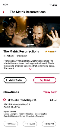
After I conducted a usability study, I proceeded to resolve problems that was highlighted. Most users stressed the need to be able to choose preferred dates and location hence, I implemented a feature that enables users to do so.
I used High resolution images to help all users better understand the designs. I provided access to users who are vision impaired through adding alt text to images for screen readers. I used icons to help make navigation easier. I also used the color RED to highlight important icons and buttons which serves as visual cues to help users easily complete a ticket purchase.


Going forward
Take aways
Next steps
Take Aways
Impact:
The app creates an experience that makes users feel like M-Theatre is truly dedicated to meeting their needs.
One quote from feedback:
“The app was so intuitive. I really like the interactive design.”
What I learned:
Working on this project has given me an insight into the various constraints users may face when trying to buy a movie ticket. It has highlighted the importance of conducting thorough research to ensure that all the relevant data is collected for the project. Furthermore, it has reinforced my belief that with the right attitude and effort, nothing is impossible. I am optimistic that this project will be the foundation for greater success in the future..
Next Steps
Conduct another round of usability studies to validate whether the pain points users experienced have been effectively addressed.
Conduct more user research to determine any new areas of need.